Hello! Well today is the day! My first blog post is going live on The Crafty Scapper's blog today. (The second one will be next Wed.) I actually have the post that is going live below, but before that, of course, I want to share a little. Here are a couple of photos of what they gave me to work with ...


As you can see in the second photo, a lot of the items are thicker, like the wood pieces, the chipboard pieces, and the flowers, than I normally add to my cards. I decided I would address this fact in the post and explain that if you go too thick, your card will more likely be one that you would give to the recipient, instead of sending by snail mail. When I owned my store, we would make samples for the store and never did I think about how thick I made one or how it would get sent. But, since I closed my store, and the fact that most of the cards I make now, I do send in the mail, my whole thought process has changed. And as you know, I also now make sure that the inside is done to complete the card. I also talked about this. I am happy with the post I did. But of course, I worry a little, as the design team coordinator told us to not make the posts too long or to show to many photos. Mine? Well, I know you can guess ... yes, it is long and too many photos. My thinking is that people can just skip over what they are not interested in but the information will be there if they are interested. I look at blogs all the time. And for me, if I am interested in their card, but they haven't included any details, I am always disappointed. The other thing is that everyone else on the design team make scrapbook pages, books or something directly related to scrapbooking. I am the only card maker. One card I made that you will see has more of a "scrapbook" feel and the other's are more "my style". Thanks for letting me give you my thoughts and background on this. Below, you will find my post ... enjoy! (P.S. See you tomorrow for the Sat. sketch share!)
Hello, it's
Tina, the resident card teacher, here today to share with you three cards I made with some fabulous products from
The Crafty Scrapper!
Before I show you my cards, I want to give you a little background.
Carolyn asked me if I would be the card maker for the design team. I was happy to do it.
I was given a packet of various papers and embellishments.
I quickly realized that thick embellishments were going to challenge my card making style.
I am one that actually sends my cards in the mail, so I am always conscience of the thickness.
But, after looking around for some ideas, I decided it would be fun to make some thicker cards.
I just have to know that the thicker ones are going to be the ones that will be hand given not sent.
So, my first card to show you is a thick one, but oh, so pretty!
And since I was going thick, I got to use my Tim Holtz Rosette die ... woo hoo.
I almost always make a card from either a sketch or
CASE (copy and share everything) one that I see that I like.
This is a CASE from one on my Pinterest board. You can see it
here.
There were flowers in my packet but I wanted the color to be brighter,
so, I changed the color with a Copic!
Easy Peasy!
The next picture shows how thick the card is.
One note, I have seen on blogs where they used a hot glue gun.
I have never used this form of adhesive
until today!
I found it worked great to adhere
the twine, flower, and rosette
to my card!
Adding that rose reminded me of a stamp!
(Of course, it did!)
So, I used the same papers and supplies
to make a second card (a thin one)!
See how different one central image can change the cards look!
Oh, and I did a CASE on
this card.
I also did my favorite technique ... paper pieced her dress to match!
Before I go onto my third card today, I want to give you a tip.
Those that have taken classes from me, know this ...
I always add panels to the inside of the card
when I am making the card.
Sometimes I stamp the inside sentiment,
but if they are cards like the two above,
you might not know the occasion it will be used for,
like birthday, thinking of you, etc.
In this case, I leave it blank.
But, adding the insides saves time
looking for the right papers later.
Here is the inside for the first two cards.
For my third card, I decided to go with a Valentine theme.
This one is in between thick and thin.
I actually did a CASE from a card I have made before.
A couple of things to note on this card...
The chipboard heart and "always' really sparkles with
that red glitzy glitter from Elizabeth Crafts!
And I wanted to add something to her dress, so
I used the Copic Colorless Blender
to add the dots!
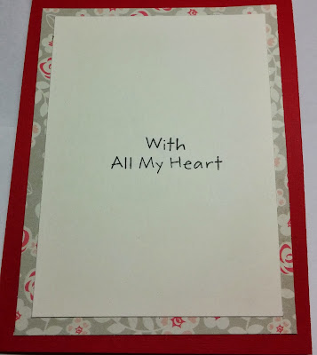
And here is the inside ...
Recipes for all three cards follows.
Card #1 & #2-
Paper-American Crafts Autumn Crisp line: "Park" (both sides), Aqua dot is from Bo Bunny Very Vintage Double Dot 6 x 6 pad, Cardstock Rose Pink, White
Stamps - Card #1 Sentiments from Inky Antics Simple Sentiments set, Card #2 Girl & Sentiments from My Favorite Things Pure Innocence Roses
Ink - Memento Black, Copics
Tools - Tim Holtz Mini Rosette die, My Favorite Things Simply Scallops Lg. die-namics, and Doily Duo Small die-namics, Spellbinders Circle
Other - Maya Road Jornaling Tags, Twine from The Twinery, KaiserCraft Paper Blooms, Rhinestones
Card #3
Paper - Crate Paper Love Notes line: "Beau Book" (both sides), Crate Paper Bingo Love card, Cardstock Red, Natural White
Stamps - My Favorite Things Pure Innocence Love You With All My Heart
Ink - Memento Black, Copics
Tools - Spellbinders On the Edge hearts die
Other - Chipboard -Heart & Always by Maya Road, Red Glitter Ritz by Elizabeth Crafts, Ribbon by May Arts
Thanks so much for stopping by!
Happy Stamping!
Tina


